Antipodium
Antipodium is a womenswear label that provides a range of versatile, contemporary clothes. The client’s request was to design a new brand identity which reflected confidence, simplicity and a hint of kink, drawing inspiration fresh from the streets of London.
Dressing women who are fiercely individual and unapologetically seductive, Antipodium has remained true to an addictively simple fashion aesthetic that appears chic, unique and effortless - just like its wearers!
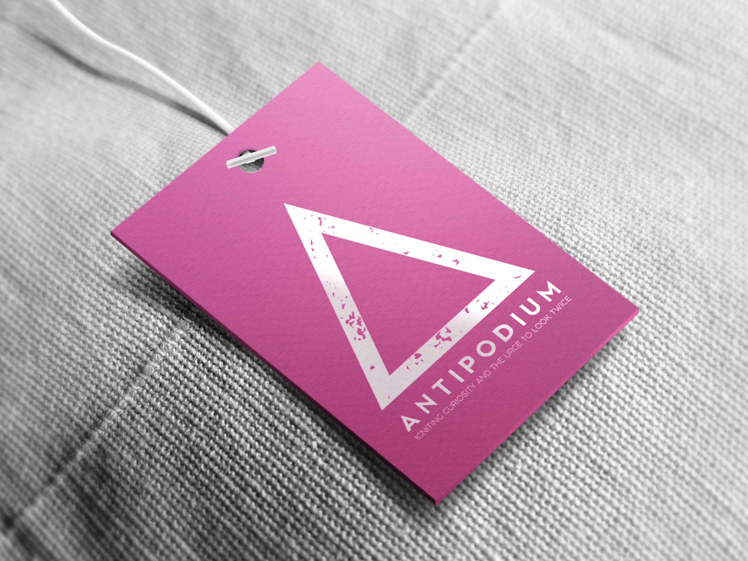
Crafted by positioning the crossbar of the letter ‘A’ towards the bottom, this triangle icon was created for the brand’s new logo, and when replicated can be used as a pattern on their sustainable packaging. Neon pink has the ability to grab immediate attention of the female target audience and also provoke sexual suggestiveness in a tasteful manner, hence being chosen as the brand’s new primary colour, alongside white which both enhances and compliments the neon pink, as a secondary colour should!
If you ‘Up the Ante’, you increase your demands in a situation in order to achieve a better result; I decided to use this as the slogan for a rebrand poster campaign to suggest to passers-by that Antipodium have recently improved the quality of their business and are now thriving with a new identity. Being a London-based brand, I situated the posters in iconic London locations that are famous for being busy, my favourite outcomes being the Underground and Piccadilly Circus. For some brands, these photographs may appear too risqué for public viewing, especially on large-scale billboards, but Antipodium is meant to represent confidence in the female form, so I continued using them to produce these posters.


